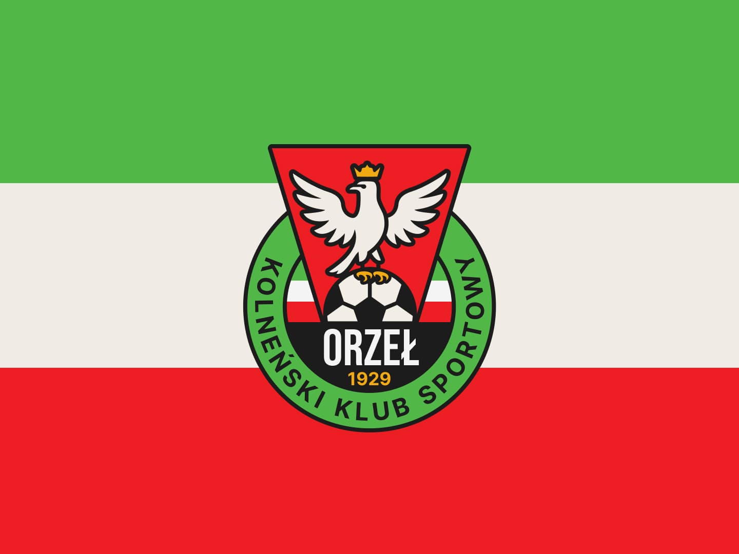
Orzeł Kolno Logo Redesign
A comprehensive logo redesign for sports club Orzeł Kolno, a historic Polish athletic association founded in 1926. The project focused on modernizing the club's traditional green-white-red colors and eagle symbol, bridging almost a century of local heritage with clean, contemporary design aesthetics.
The Challenge
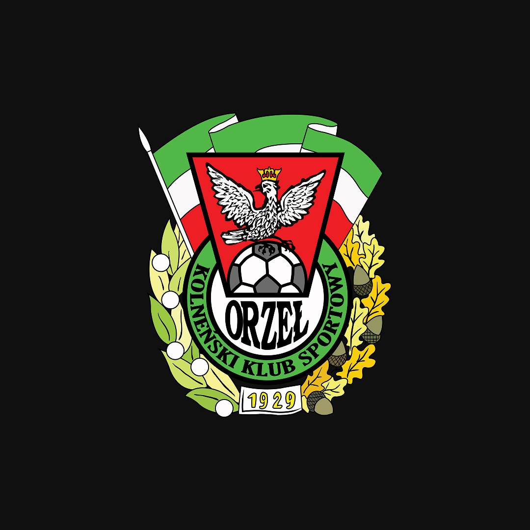
Refreshing a logo carrying nearly a century of athletic tradition is a massive responsibility. The primary challenge was to simplify the complex, legacy eagle illustration into a clean, modern vector emblem without losing its iconic character, ensuring it remains highly legible and sharp at any scale.
The Solution
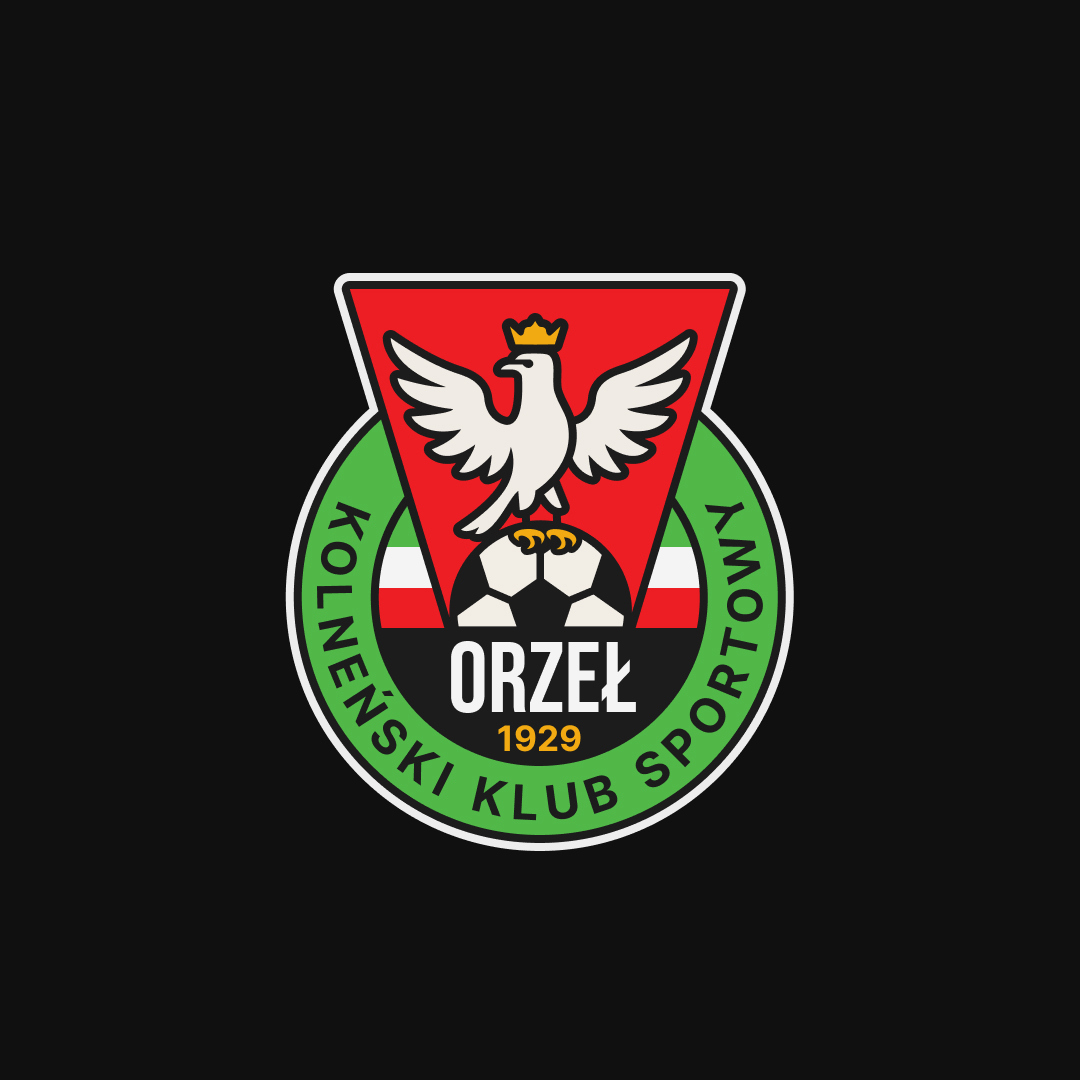
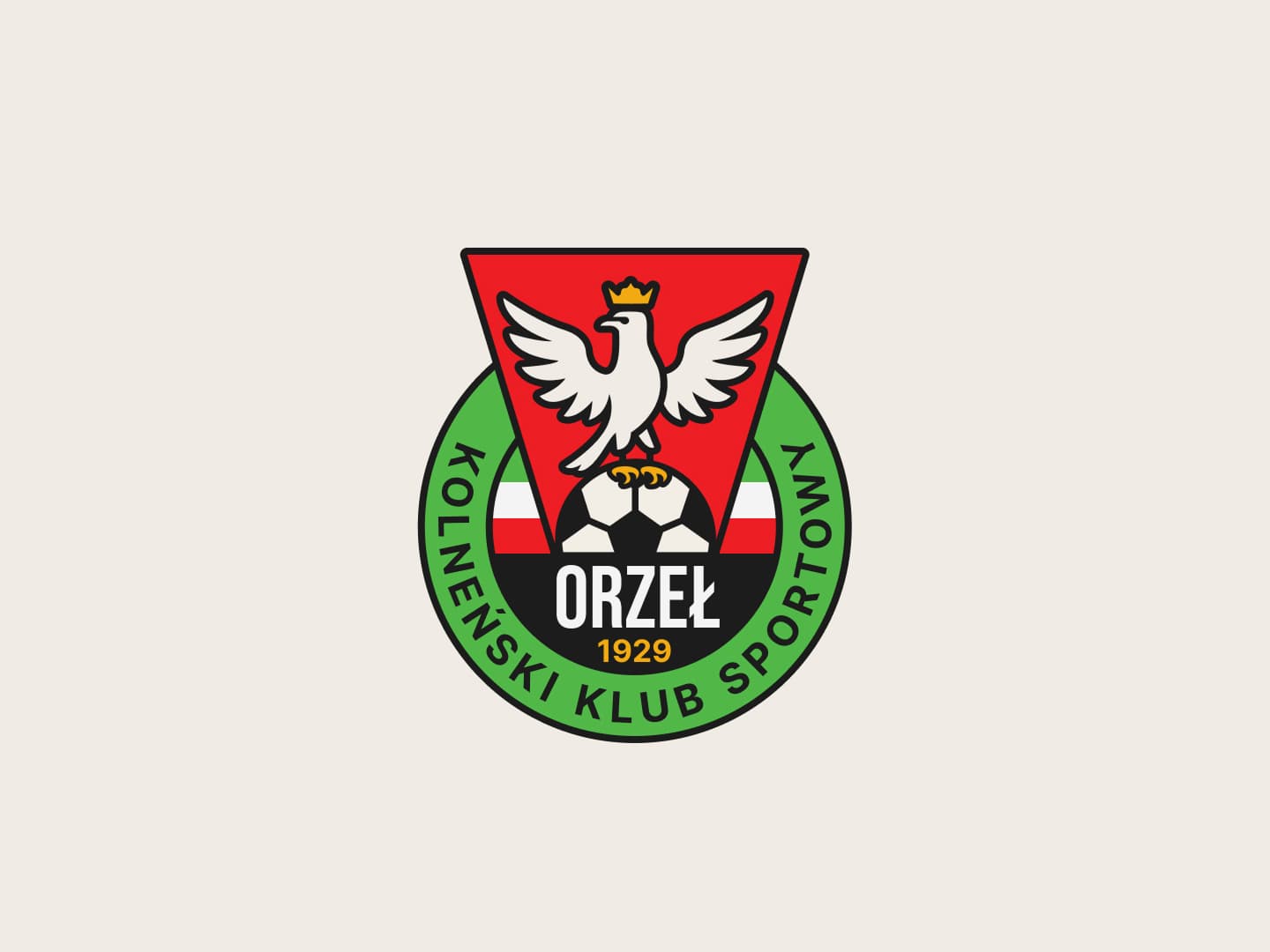
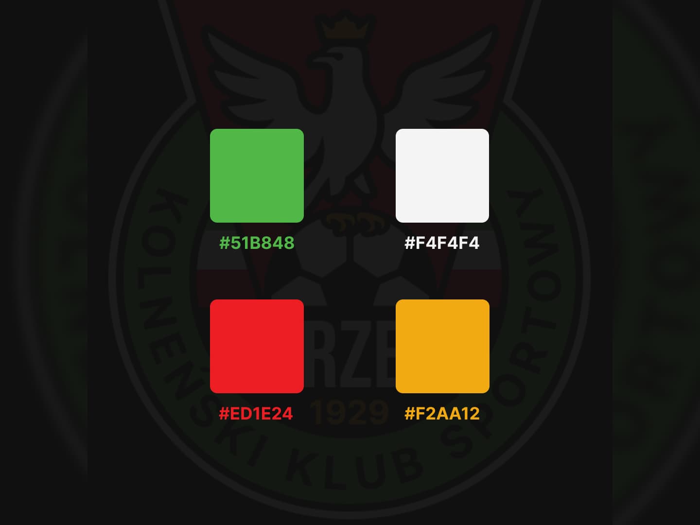
I designed a powerful, geometric eagle emblem constructed on a precise grid system, standardizing the official green-white-red color palette. Alongside the main icon, I developed custom athletic typography to create a cohesive lockup that balances dynamic energy with modern geometry.